1. 概述
在这个教程中,我们将学习如何使用JFreeChart,一个功能强大的Java库,用于创建各种各样的图表。我们可以利用它在Swing应用中集成图形数据表示。此外,还有一个针对JavaFX的独立扩展包here。
我们将从基础开始,涵盖设置和图表创建,并尝试几种不同类型的图表。
2. 创建第一个图表
JFreeChart支持线图、柱状图、饼图、散点图、时间序列图、直方图等。它还能将不同类型图表组合到一个视图中。
2.1 设置依赖项
首先,我们需要在pom.xml文件中添加jfreechart的依赖:
<dependency>
    <groupId>org.jfree</groupId>
    <artifactId>jfreechart</artifactId>
    <version>1.5.4</version>
</dependency>
在使用前,请务必检查最新的版本(如1.5.4)及其与JDK的兼容性,以确保项目最新且运行正常。在这种情况下,版本1.5.4需要JDK8或更高版本。
2.2 创建基本线图
我们先用DefaultCategoryDataset来创建数据集:
DefaultCategoryDataset dataset = new DefaultCategoryDataset();
dataset.addValue(200, "Sales", "January");
dataset.addValue(150, "Sales", "February");
dataset.addValue(180, "Sales", "March");
dataset.addValue(260, "Sales", "April");
dataset.addValue(300, "Sales", "May");
然后,我们可以创建一个使用先前数据集绘制线图的JFreeChart对象:
ChartFactory.createLineChart()方法接受图表标题、x轴和y轴标签以及数据集作为参数:
JFreeChart chart = ChartFactory.createLineChart(
    "Monthly Sales",
    "Month",
    "Sales",
    dataset);
接下来,为了在Swing组件中显示图表,我们需要ChartPanel对象。然后,这个对象被用作JFrame的内容面板来创建应用程序窗口:
ChartPanel chartPanel = new ChartPanel(chart);
JFrame frame = new JFrame();
frame.setSize(800, 600);
frame.setContentPane(chartPanel);
frame.setLocationRelativeTo(null);
frame.setDefaultCloseOperation(JFrame.EXIT_ON_CLOSE);
frame.setVisible(true);
运行这段代码后,我们会看到月度销售的图表:
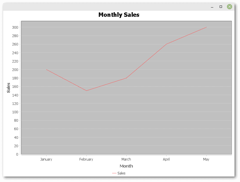
如我们所见,仅用少量代码即可创建图表。
探索不同类型的图表
在接下来的例子中,我们将尝试其他类型的图表。代码改动不大。
3.1 柱状图
只需稍作修改JFreeChart创建代码,就能将线图转换为柱状图:
JFreeChart chart = ChartFactory.createBarChart(
    "Monthly Sales",
    "Month",
    "Sales",
    dataset);
这将绘制之前示例中的数据集:
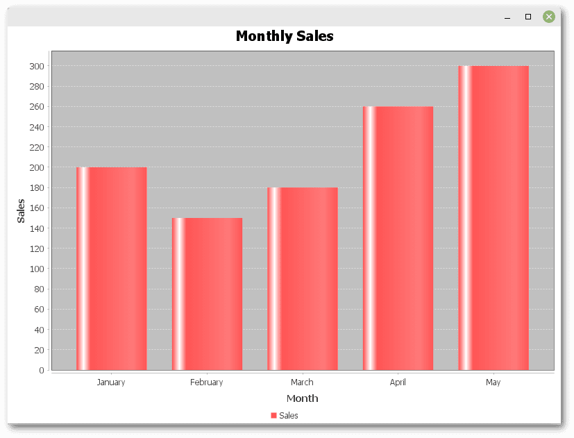
可以看到,JFreeChart非常灵活,能够轻松地以不同的图表类型展示相同的数据。
3.2 饼图
饼图显示整体中各个部分的比例。要创建饼图,我们需要使用DefaultPieDataset类创建数据集,并使用createPieChart()方法构建JFreeChart对象:
DefaultPieDataset<String> dataset = new DefaultPieDataset<>();
dataset.setValue("January", 200);
dataset.setValue("February", 150);
dataset.setValue("March", 180);

JFreeChart chart = ChartFactory.createPieChart(
    "Monthly Sales",
    dataset,
    true,    // include legend
    true,    // generate tooltips
    false);  // no URLs
当鼠标悬停在饼图的某一部分时,会显示绝对销售额和总销售额的百分比:
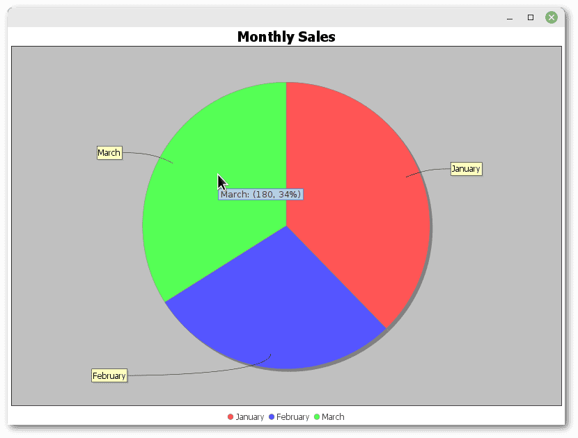
最后,需要注意ChartFactory.createPieChart()方法有许多变体,以便进行更精细的定制。
3.3 时间序列图表
时间序列图表展示了随时间变化的数据趋势。构建数据集时,我们需要TimeSeriesCollection对象,它是包含多个TimeSeries对象的集合,每个对象是一系列包含与特定时间区间相关值的数据项:
TimeSeries series = new TimeSeries("Monthly Sales");
series.add(new Month(1, 2024), 200);
series.add(new Month(2, 2024), 150);
series.add(new Month(3, 2024), 180);

TimeSeriesCollection dataset = new TimeSeriesCollection();
dataset.addSeries(series);

JFreeChart chart = ChartFactory.createTimeSeriesChart(
    "Monthly Sales",
    "Date",
    "Sales",
    dataset,
    true,    // legend
    false,   // tooltips
    false);  // no URLs
下面是结果:
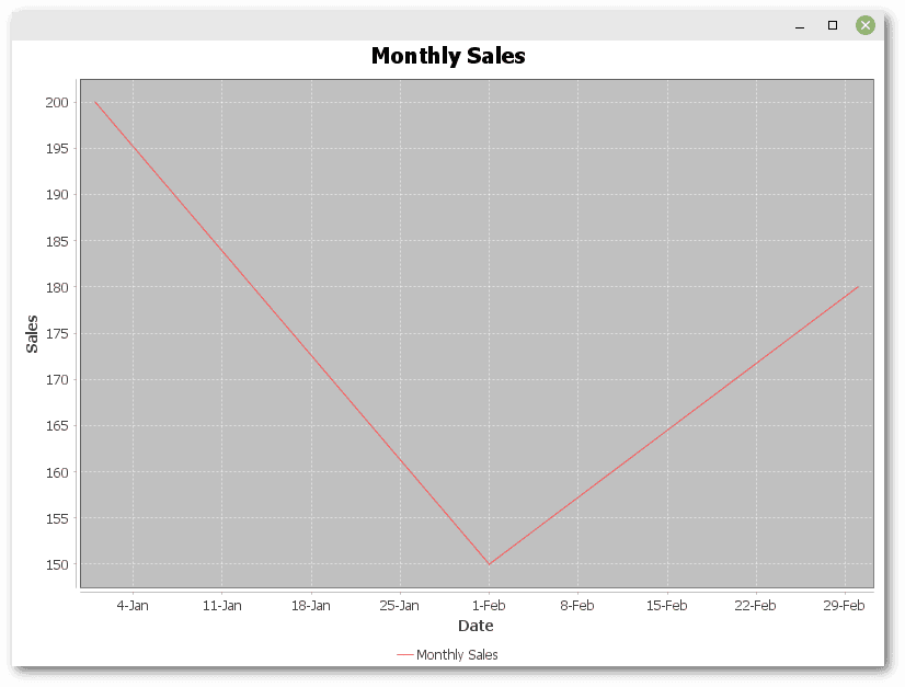
这个例子展示了JFreeChart在绘制时间序列数据方面的强大之处,便于追踪随时间的变化。
3.4 组合图表
组合图表允许我们将不同类型的图表组合在一个图表中。与前面的示例相比,代码稍微复杂一些。
我们需要使用DefaultCategoryDataset存储数据,但这里我们为每种图表类型创建两个实例:
DefaultCategoryDataset lineDataset = new DefaultCategoryDataset();
lineDataset.addValue(200, "Sales", "January");
lineDataset.addValue(150, "Sales", "February");
lineDataset.addValue(180, "Sales", "March");

DefaultCategoryDataset barDataset = new DefaultCategoryDataset();
barDataset.addValue(400, "Profit", "January");
barDataset.addValue(300, "Profit", "February");
barDataset.addValue(250, "Profit", "March");
CategoryPlot创建包含两种图表类型的绘图区域。它允许我们将数据集分配给渲染器——LineAndShapeRenderer用于线条,BarRenderer用于条形:
CategoryPlot plot = new CategoryPlot();
plot.setDataset(0, lineDataset);
plot.setRenderer(0, new LineAndShapeRenderer());

plot.setDataset(1, barDataset);
plot.setRenderer(1, new BarRenderer());

plot.setDomainAxis(new CategoryAxis("Month"));
plot.setRangeAxis(new NumberAxis("Value"));

plot.setOrientation(PlotOrientation.VERTICAL);
plot.setRangeGridlinesVisible(true);
plot.setDomainGridlinesVisible(true);
最后,用JFreeChart创建最终的图表:
JFreeChart chart = new JFreeChart(
    "Monthly Sales and Profit",
    null,  // null means to use default font
    plot,  // combination chart as CategoryPlot
    true); // legend
这样的设置使得销售和利润之间的协同效应可视化呈现:
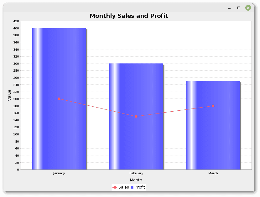
这样,JFreeChart可以展示复杂的需要多种图表类型来理解和分析的数据集。
4. 结论
在这篇文章中,我们探讨了使用JFreeChart创建不同类型的图表,包括线图、柱状图、饼图、时间序列图和组合图表。
这只是JFreeChart功能的冰山一角。
一如既往,本文的代码可在GitHub上找到。