1. Overview
An Apache JMeter test execution ends with some outcomes that we need to analyze if we want to improve our service performance. These outcomes can be on the service side, with logs and metrics, or on the test execution side, with JMeter results produced for response error code rate, throughput, and more.
JMeter offers many ways to read test results, each of which might come in handy in different cases. There are many built-in options, but if we want even more advanced reports, the JMeter community provides many free plugins for this.
In this tutorial, we’ll focus on analyzing JMeter Results. We’ll look at the most popular available options and then dive deeper into some more commonly used ones, using only JMeter-enhanced tools.
2. Analyzing JMeter Results
After we run a performance test, we want to be able to observe the results and understand them to make improvements.
The results of a performance test can be observed from two different sources. First is the service under test itself. From this source, we can collect metrics like the JVM memory usage, active threads, and execution time for a DB transaction or a downstream REST request.
Second is the point of the client making the request, which in this case is the tool we use to execute the performance test. From that point, we can collect metrics about the total response time, failed requests rate, amount of requests sent, throughput, etc.
JMeter offers all of this info needed in many different ways and through different tools. We can group them into three categories:
- JMeter reports, including a special HTML Reporting Dashboard tool
- plugins
- hosted result services
3. Analyzing JMeter Results With Hosted Services
JMeter ships with:
- a GraphiteBackendListenerClient which allows us to send metrics to a Graphite Backend
- an InfluxDBBackendListenerClient which allows us to send metrics to an InfluxDB Backend
These backend listener clients store results in an external DB in real time. This allows us to keep the history of data and use history to compare multiple executions from different times, different versions of our service, and more.
We can use hosted result services such as BlazeMeter Sense, Grafana, or Taurus, to get reports and dashboards back from a test result and use them to understand results. Those hosted services can be either cloud or self-hosted.
3.1. Risks of Using Hosted Services
Using hosted services has benefits, like using some tools that are created for the specific reason of creating dashboards. Grafana, for example, has very rich dashboards, to visualize results.
On the other hand, this approach increases complexity, risks, and sometimes costs. If we use only open-source, free tools, we can’t guarantee that the service exists forever or that it’s always free.
For example, BlazeMeter Sense started as a free cloud service, but at some point, this stopped. Now, we have to set up our own local BlazeMeter Sense server in order to use it with JMeter results.
Moreover, self-hosted services increase complexity, because we need to know on a lower level how they’re being set up, and they also increase costs, for machines to host them.
Further, in most cases, like using Grafana or Taurus to visualize JMeter results, we need to self-host more than one service. This is because the data we produce need to be stored somewhere so that these services can retrieve them. For self-hosted Grafana, we’d have to:
- self-host a database
- set a Backend Listener in our JMeter test to connect to our database
- setup Grafana server and connect it to the same database as the source
- create the dashboards we want in Grafana UI, using the metrics exported from JMeter to our self-hosted database
4. Analyzing JMeter Results With JMeter Plugins
Apache JMeter is a very popular and open-source tool, which makes it also well backed by plugins created by the community, that cover actual engineers and testers’ needs. For JMeter results, the list of plugins goes on and on. Some of the more popular ones are:
- JMeterPluginsCMD is a small command-line utility for generating graphs out of JTL files. It behaves just like the right-click context menu on all graphs.
- Graphs Generator Listener generates the following graphs at the end of a test:
Active Threads Over Time, Response Times Over Time, Transactions per Second, Server Hits per Second, Response Codes per Second Response, Latencies Over Time Bytes, Throughput Over Time, Response Times vs Threads Transaction, Throughput vs Threads, Response Times Distribution, Response Times Percentiles. - JWeter is another popular tool for analyzing and visualizing JMeter result files.
- JMeter Result Analysis Plugin is a Maven plugin that parses JMeter result XML files and generates detailed reports with charts.
- UbikLoadPack observability plugin allows us to monitor a non-GUI/ CLI performance test from our favorite browser.
5. Analyzing JMeter Results With JMeter Report Listeners
We can gather JMeter results by using the different kinds of reports listeners provided. These listeners collect data during the test plan execution and then present it in various formats, such as plain text, aggregated data, tables, graphs, and more.
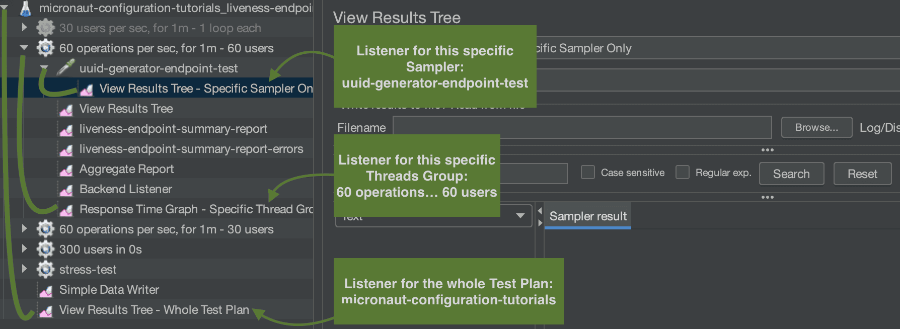
We can set listeners for different scopes, such as different listeners for different samplers, listeners for a specific thread group, or even listeners for the whole test plan execution:
In this scenario, we only have one sampler, so the sampler-specific listener does the same as the thread group one, but for more samplers that wouldn’t be the case. The test plan-wide listener collects data for all thread groups and all samplers.
For our demonstration, we’re going to use a Spring Boot application and we’ll be testing an endpoint that creates a UUID and returns it in the response body. The samplers of the different thread groups will all be pointing to this endpoint:
In the picture, we see the sampler ‘uuid-generator-endpoint-test‘ that points to the Spring Boot server running on localhost, port 8080 and the path is /api/uuid.
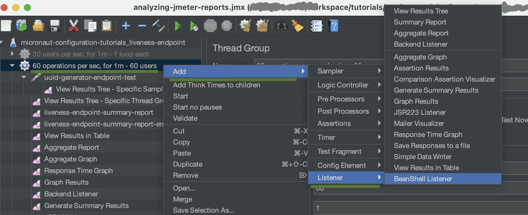
The way to add a listener, in our test plan, is by right-clicking on the item we want to add the listener to -> Add -> Listener:
Here, we select to add to the ’60 operations per sec, for 1m – 60 users‘ sampler some listeners, following the steps described earlier. We have added a View Results Tree and a Table, a Response Time Graph, and more, which we’ll see later.
5.1. View Results Tree and Table Listeners
Using the View Results listeners, we can collect metrics about the requests and responses made by JMeter and also some info about the full transaction, like latency, sent bytes, time of execution, etc.
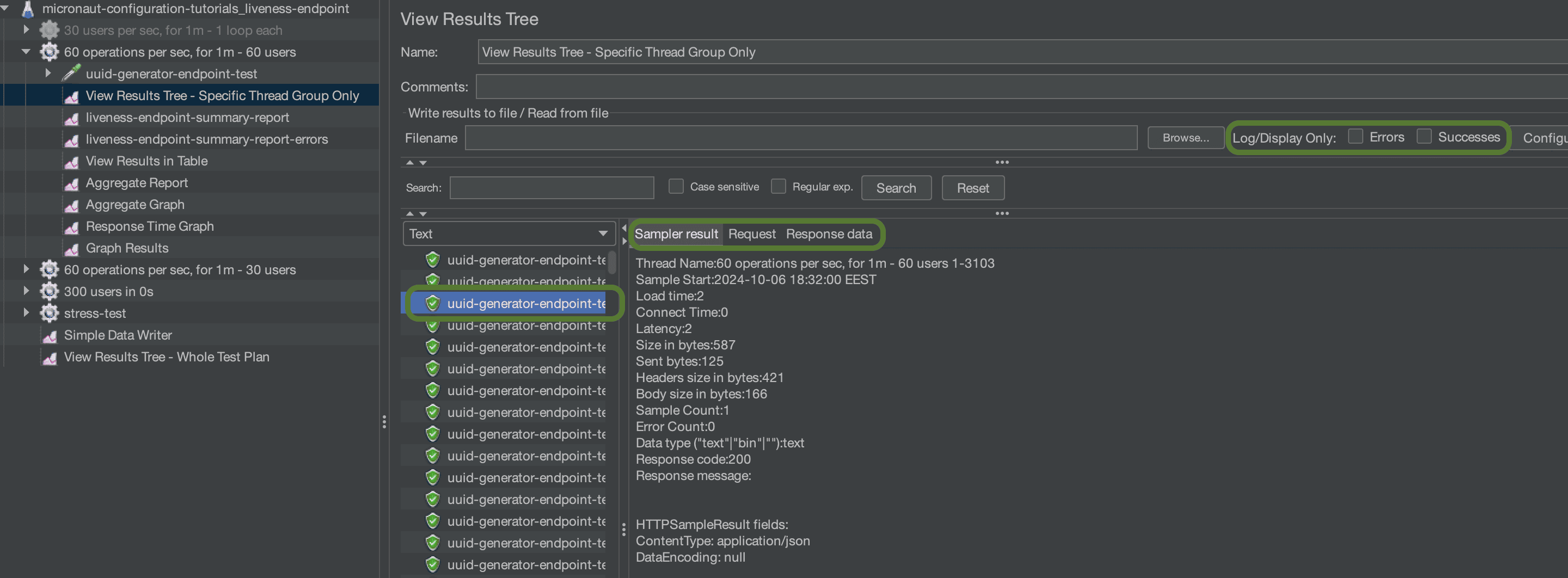
View Results Tree gives a list of all of the requests made:
In most JMeter results listeners, there is an option to filter requests by errors only or successes only, if we like. In our listeners, we collect all successes and errors. We also get the option to view results in a file, if we want to store the outcome for history or to view it later. We won’t be using it in our demonstration.
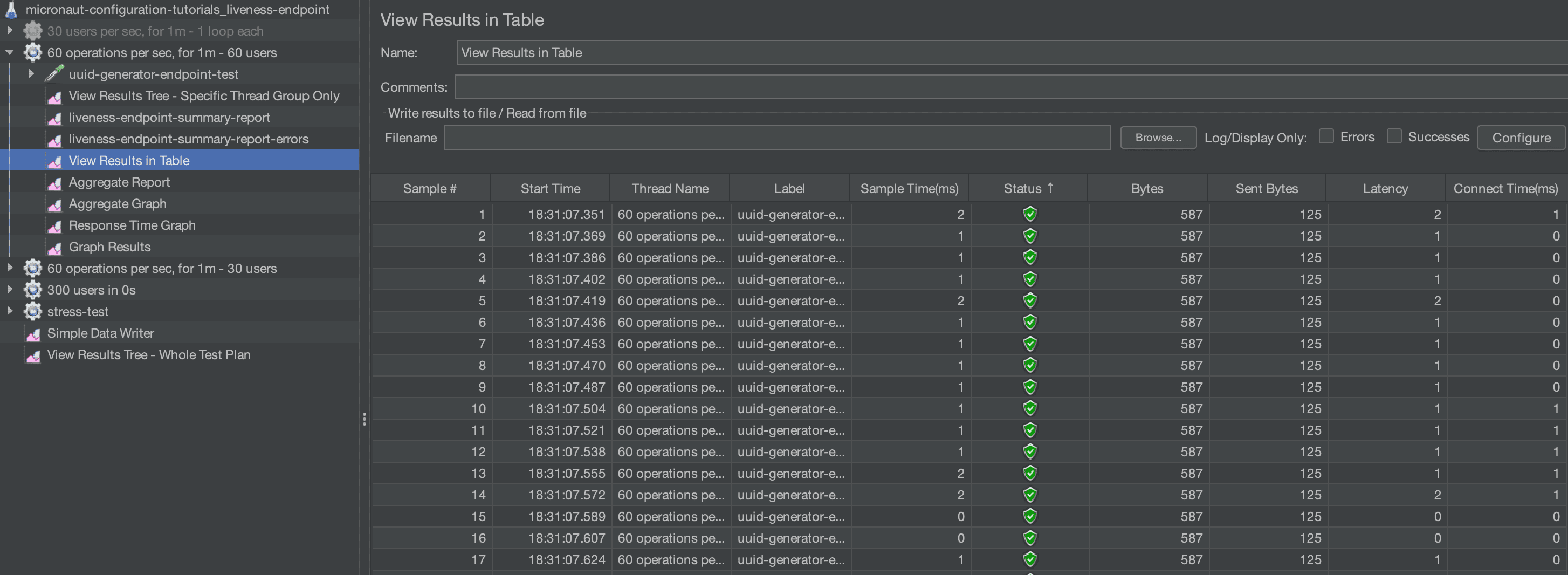
In a similar fashion, the View Results in Table offers the same info but in the form of a table:
This way, we can do things like sort by column and we can easier browse our data.
5.2. Aggregate Report and Graph Listeners
As the term says, Aggregate Report and Aggregate Graph listeners collect the same data as View Results listeners and then aggregate them. These listeners then offer the result in the form of statistical values, like Average, Median, 99% Percentile, Throughput, etc.
The Aggregate Report offers those values in the form of a table, where each line represents a sampler (in our example we only have one sampler):
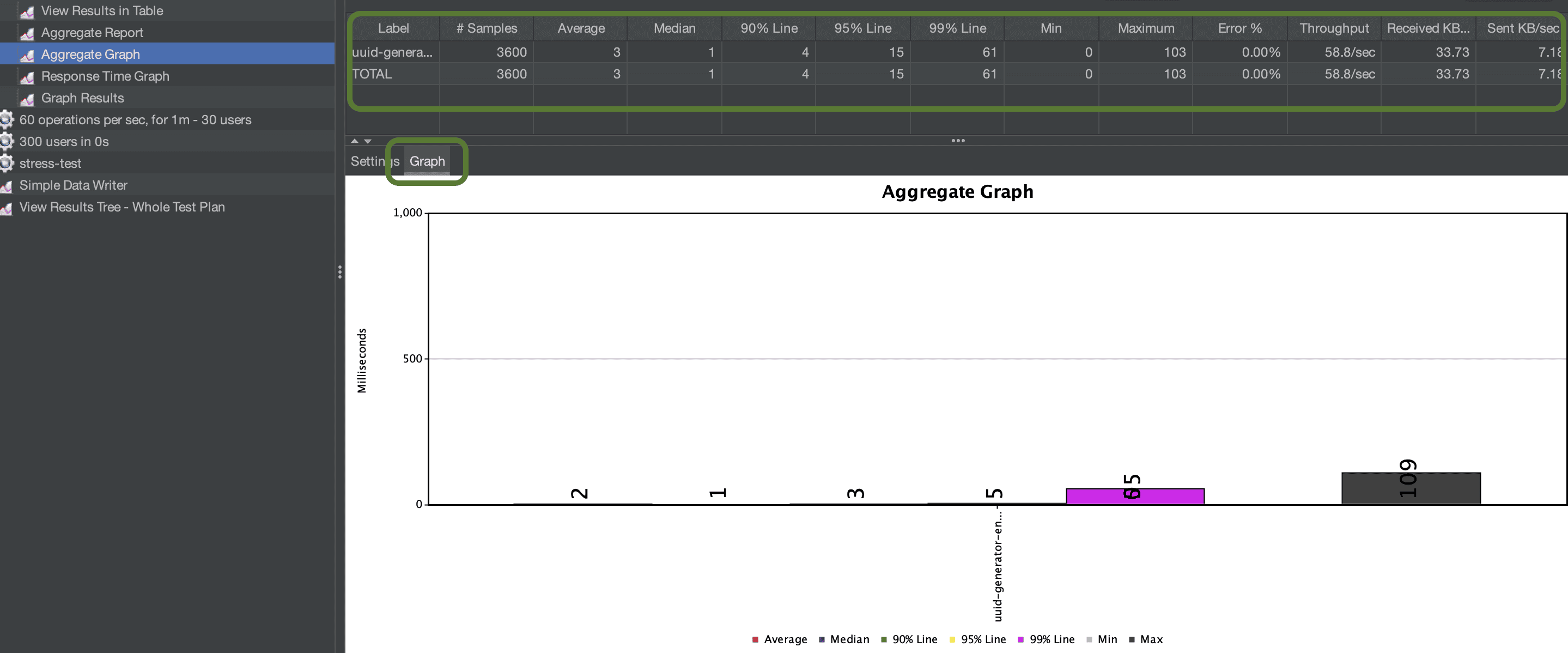
Aggregate Graph does the same things as the Aggregate Report, but on top, it offers a graph of some of the values, like Min, Max, 99% Line, and more:
As we can see in this graph, the default JMeter graphs from listeners aren’t the best tools to visualize results and provide minimum configuration. This is why JMeter offers the dashboard report GUI, as we’ll see later on, and integration with more appropriate tools like Grafana.
5.3. Response Time Graph
Response Time Graph listener exports statistics about the timings of the samples taken. By this we mean, for example, in a REST application, what is the time taken for the response to be received by JMeter?
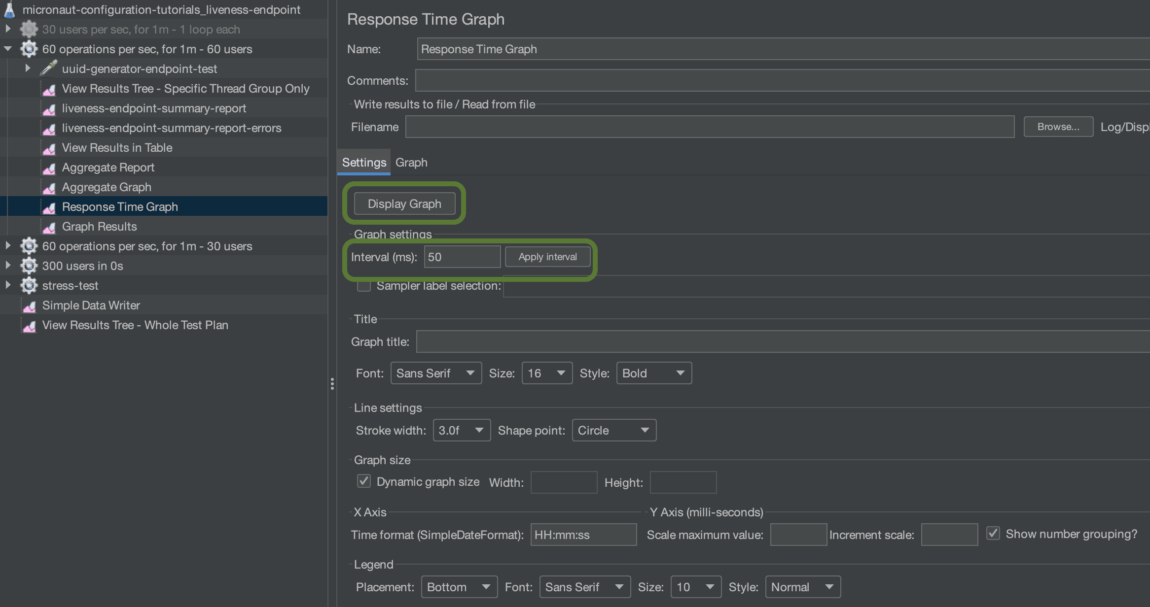
The Response Time Graph has two modes. First, we set it up in the Settings mode:
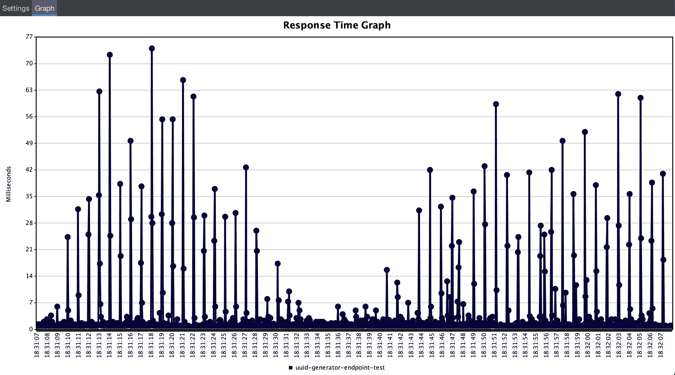
Here, we can see some things about fonts, axis, etc, but we also get one configuration that actually helps us make a graph more descriptive. This is the Interval. We can change this value to get a more or less detailed graph. If we set an interval of 50 milliseconds, then we get some more vertical lines in our graph. We should remember to ‘Apply Interval‘ and then ‘Display Graph‘:
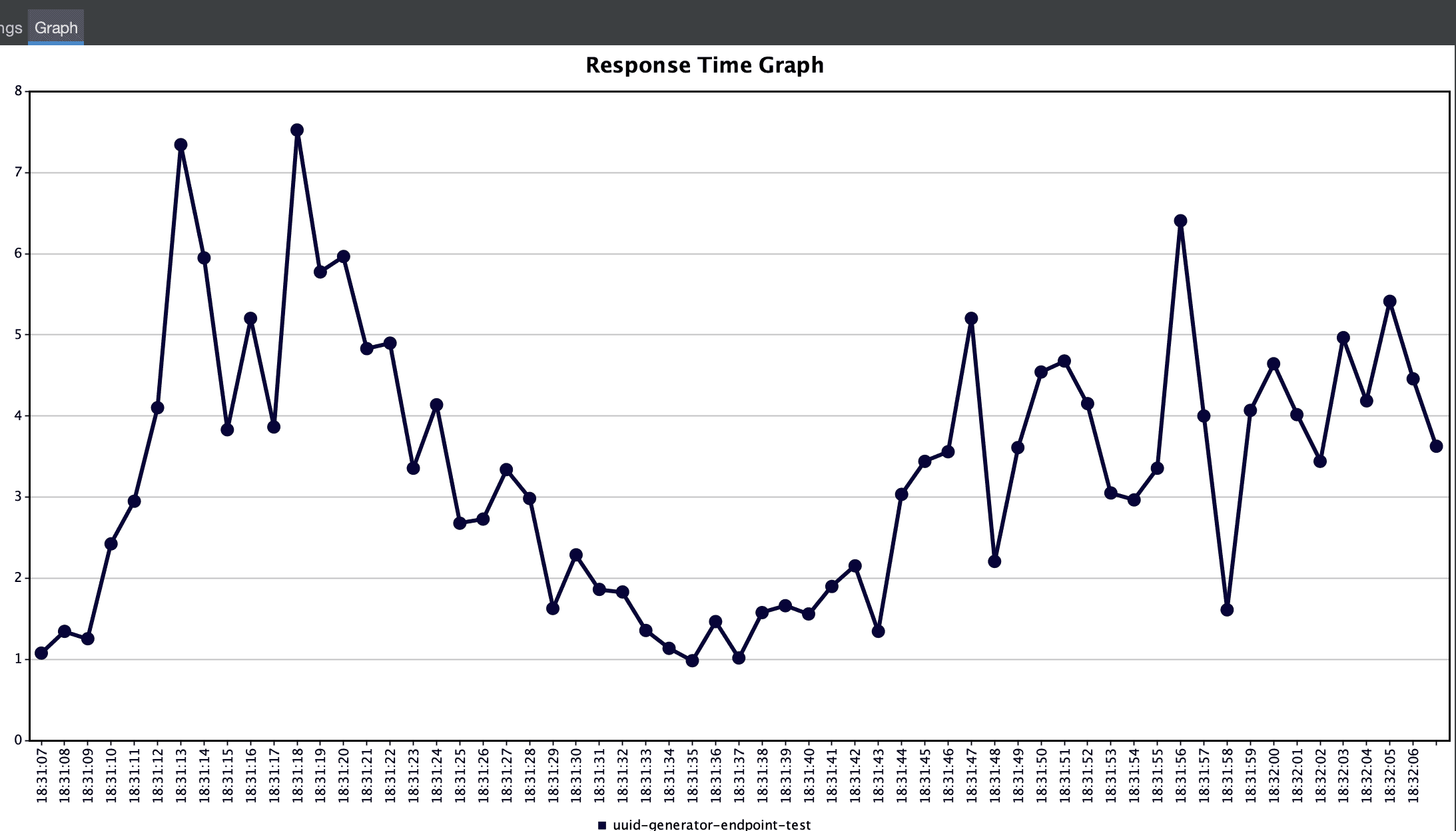
In this graph, we can see some average response times for 50-millisecond intervals. It contains some more information but the result isn’t that presentable. If we change it to one second, then we get a really nice visualization of the response times for this execution:
5.4. Graph Results Listener
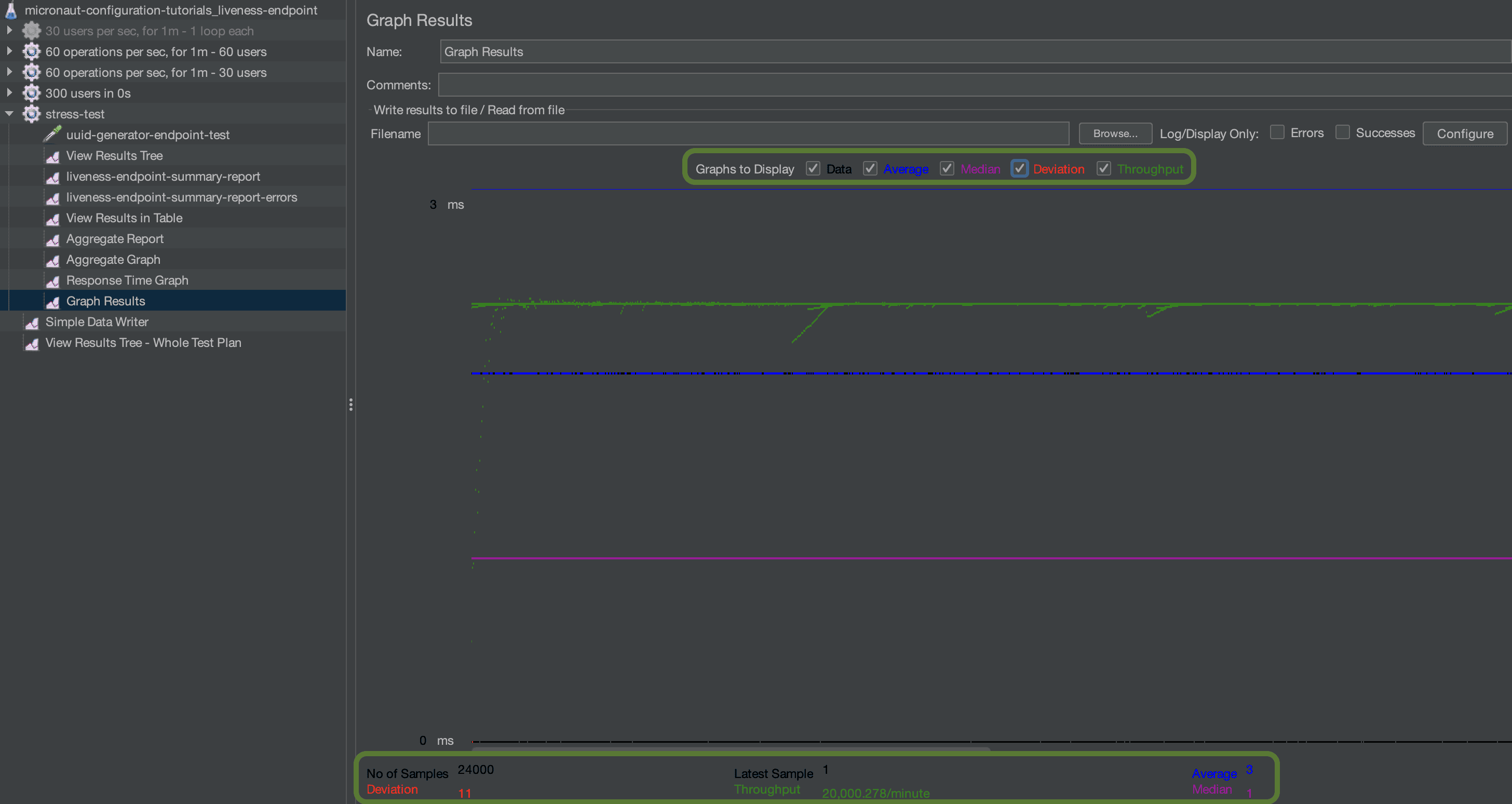
One final JMeter results listener that might come in handy is the Graph Results listener. Graph Results listener collects all data, aggregates them, and presents them in a graph, with the values over time. This is very similar to the Aggregate Report since the items are the same: Average, Median, Deviation, and Throughput. The difference here is that we can see all those over time:
6. Analyzing JMeter Results With JMeter Dashboard Report GUI
As we’ve seen so far, JMeter results graphs aren’t the best in visualizing the metrics we want. This is why JMeter offers a GUI with dashboards of the reports created during a test execution. These dashboards aren’t created by default though. We need to follow a process to create them:
- Add a Simple Data Writer listener to the test plan, to write the results to a file:

- Create a properties file, to configure things like timestamp_format, threads, and more
- Use the ‘Generate HTML Report‘ from tools to create an output folder with the HTML reports:
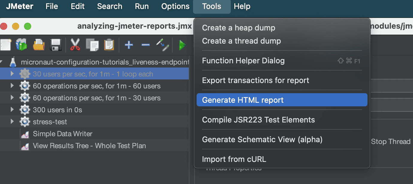
- In the pop-up window set the JTL and properties files and a folder for the output:
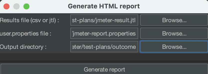
- Open the index.html file from the output folder in a browser, to access the reports
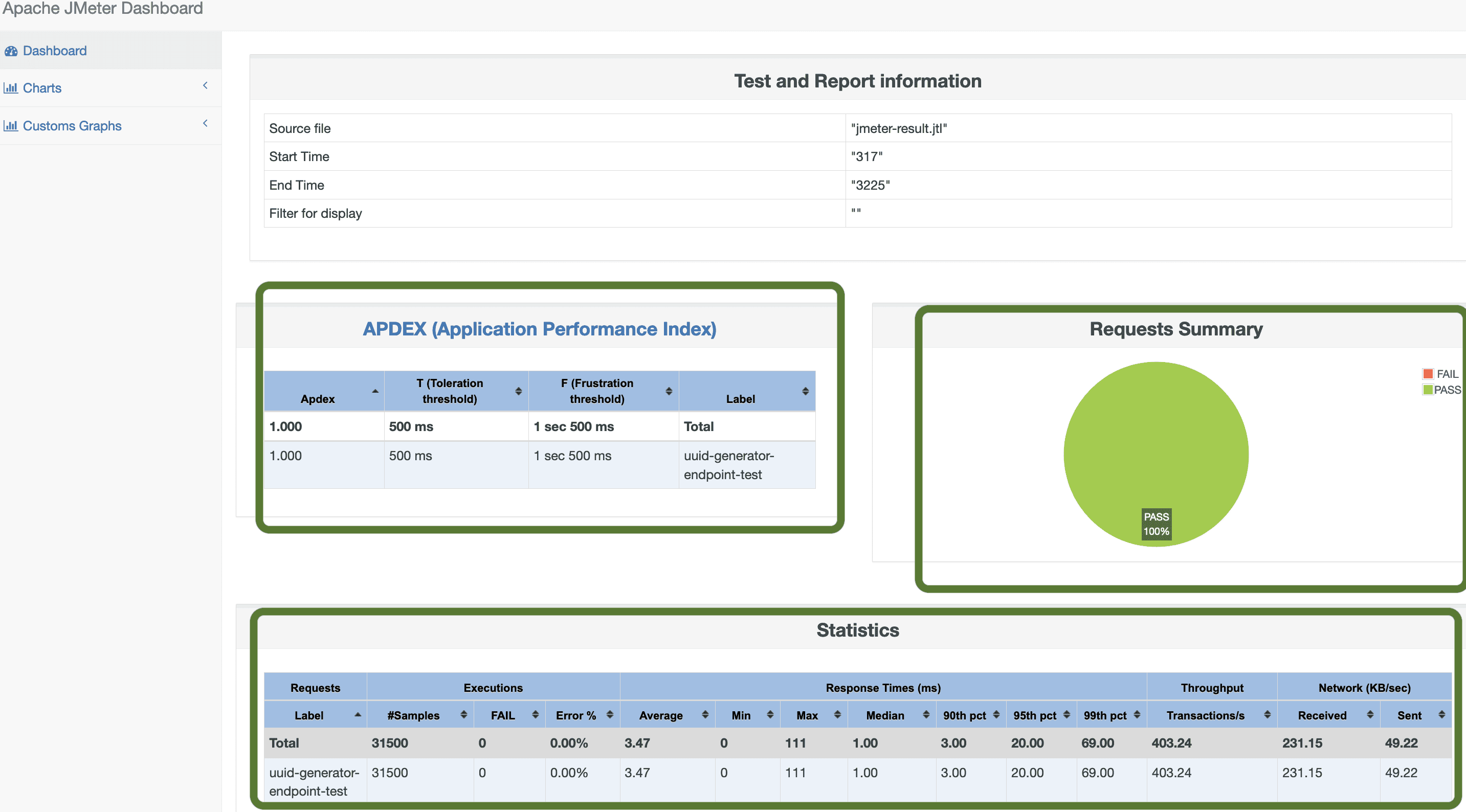
Then, we can take a look at the HTML pages we created, starting with the index.html which is a summary page:
This summary page contains a request summary pie chart and two tables, one of the Application Performance Index and one with other statistics.
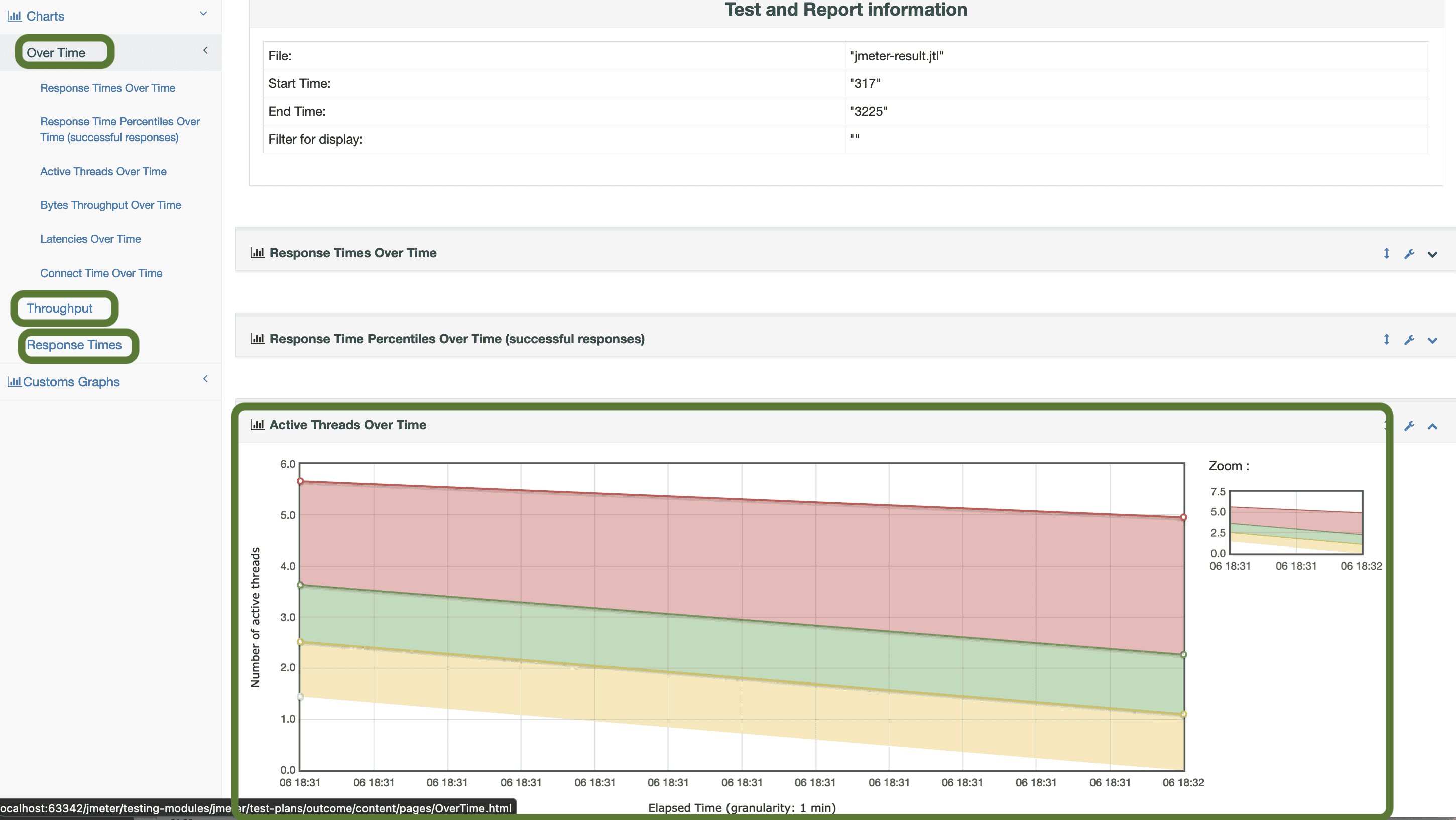
From the left side menu, we can navigate to some more charts:
In this list, we can choose from ‘Over Time‘, ‘Throughput‘, or ‘Response Times‘ charts and display charts like ‘Active Threads Over Time‘, ‘Time Vs Threads‘, and many more.
7. Conclusion
In this article, we went through the options for analyzing Apache JMeter results. We examined the option of self-hosted tools and listed some of the more popular plugins. Finally, we had a deeper look into the JMeter-enhanced options. We demonstrated the usage of both JMeter’s different reports and the dashboard report GUI provided by the JMeter.
As always, all the source code used in the examples the JMeter test execution (.jmx) and the JMeter results (.jtl) files can be found over on GitHub.
