1. 概述
Vaadin Flow 是一个针对 Java 的 web 全栈开发框架。Vaadin Flow 的设计目的是让 Java 开发者能够使用 Java 开发 web 应用,而不需要 JavaScript 或 HTML。 Vaadin Flow 可以用于任何种类的 web 应用,特别是数据丰富的商业应用程序。
Vaadin Flow 基于 Vaadin UI 组件,提供了一个直观的 Java API 用于构建用户界面。在本教程中,我们将涵盖 Vaadin Flow 的核心概念和特性。
2. 创建 Vaadin Flow 项目
We can create a Vaadin Flow project by adding the Vaadin dependency in Spring Initalizr, or downloading a customized starter on Vaadin Start.
Alternatively, we can add Vaadin Flow to an existing Spring Boot project, by adding the following bill of materials (BOM) in pom.xml. We initialize the vaadin.version property with the latest version of vaadin-bom.
<properties>
    <vaadin.version>24.3.6</vaadin.version>
</properties>

<dependencyManagement>
    <dependencies>
        <dependency>
            <groupId>com.vaadin</groupId>
            <artifactId>vaadin-bom</artifactId>
            <version>${vaadin.version}</version>
            <type>pom</type>
            <scope>import</scope>
        </dependency>
    </dependencies>
</dependencyManagement>
To complete the setup, we add the following dependency:
<dependency>
    <groupId>com.vaadin</groupId>
    <artifactId>vaadin-spring-boot-starter</artifactId>
</dependency>
You can find starter projects for other stacks like Quarkus, JakartaEE, or plain servlet on the Vaadin website.
3. 使用组件构建用户界面
Vaadin Flow 是一个基于组件的框架。每个组件都由一个 Java 对象表示:
var textField = new TextField("Name");
var button = new Button("Click me");
4. UI布局 - Layout
We can build views out of components by using Layouts. Layouts control the positioning, alignment, and spacing of components. The basic layouts are HorizontalLayout and VerticalLayout. We can build more complex layouts by combining the two.
var verticalLayout = new VerticalLayout(
  new Button("Top"),
  new Button("Middle"),
  new Button("Bottom")
);
var horizontalLayout = new HorizontalLayout(
  new Button("Left"),
  new Button("Center"),
  new Button("Right")
);
In addition to HorizontalLayout and VerticalLayout, Vaadin Flow includes layouts for more specific use cases:
- FormLayout: for forms where input labels should be placed next to the field.
- SplitLayout: for separating two content areas with a resizable splitter.
- Div: for controlling content placement through CSS (advanced).
Here’s how we put it all together to build a more complex layout with a resizable SplitLayout as the parent layout, a Grid component as the first component, and a VerticalLayout nesting a HorizontalLayout as the second component.
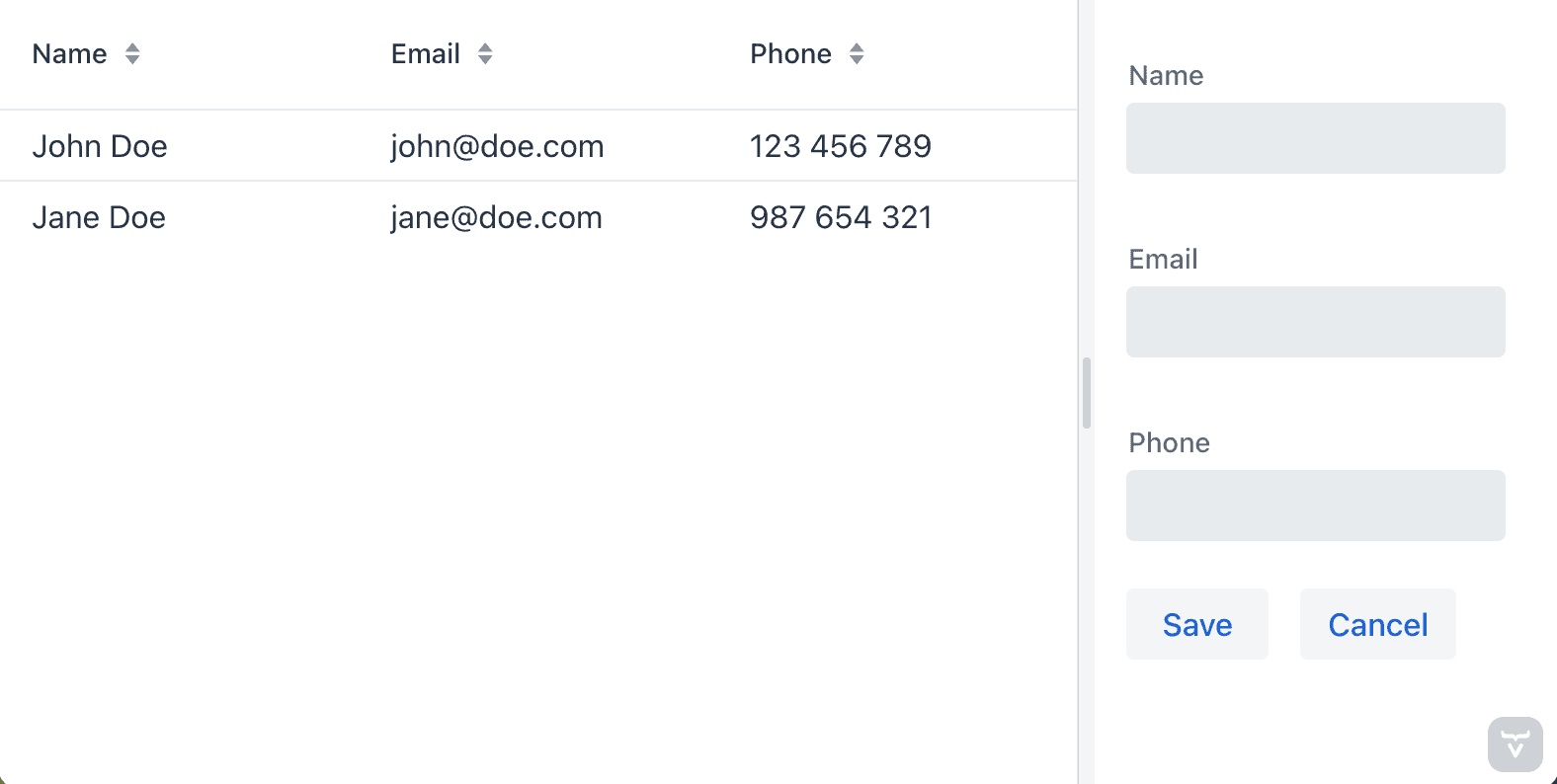
public class ExampleLayout extends SplitLayout {
    public ExampleLayout() {
        var grid = new Grid<>(Contact.class);
        grid.setColumns("name", "email", "phone");
        grid.setItems(List.of(
          new Contact("John Doe", "[email protected]", "123 456 789"),
          new Contact("Jane Doe", "[email protected]", "987 654 321")
        ));

        var form = new VerticalLayout();

        var nameField = new TextField("Name");
        var emailField = new TextField("Email");
        var phoneField = new TextField("Phone");
        var saveButton = new Button("Save");
        var cancelButton = new Button("Cancel");

        form.add(
          nameField,
          emailField,
          phoneField,
          new HorizontalLayout(saveButton, cancelButton)
        );

        setSizeFull();
        setSplitterPosition(70);
        addToPrimary(grid);
        addToSecondary(form);
    }
}
5. 使用 @Route 将组件转换为视图
我们可以通过在组件上添加 @Route 注解,将任何组件,通常是布局,转换为视图:
@Route("hello-world") // available on /hello-world
public class HelloWorldView extends VerticalLayout {
    public HelloWorldView() {
        add(new H1("Hello, World!"));
    }
}
We can navigate to views using a RouterLink:
var link = new RouterLink("Hello world view", HelloWorldView.class);
6. 事件监听
Vaadin Flow is an event-driven framework. You can listen for user events on components to update the UI on user interaction.
var nameField = new TextField("Your name");
var helloButton = new Button("Add");

helloButton.addClickListener(e -> {
    Notification.show("Hello, " + nameField.getValue());
});
7. 使用Data Grid展示Java对象
Vaadin Flow runs on the server JVM, which means we have convenient access to services. Instead of calling remote services from the frontend, we call services as Java methods. Let’s look at how we can hook up a data grid to a Spring Data repository.
The Grid is backed by a collection of Java objects. In this example, we use a Contact JPA entity defined as follows:
@Entity
public class Contact {
    @Id
    @GeneratedValue
    private Long id;
    private String name;
    private String email;
    private String phone;

    // constructors, getters, setters
}
We can then create the Grid and configure its columns as follows:
var grid = new Grid<Contact>();

grid.addColumn(Contact::getName).setHeader("Name");
grid.addColumn(Contact::getEmail).setHeader("Email");
grid.addColumn(Contact::getPhone).setHeader("Phone");
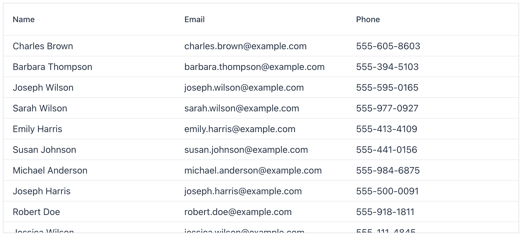
The Grid component supports two ways of adding data. The simple case is passing an in-memory list of items:
var contacts = contactRepository.findAll();
grid.setItems(contacts);
For larger data sets, we can give the Grid a callback that it can use to lazily load data from the backend:
grid.setItems(query -> {
    // Create a PageRequest based on page, offset, filter, sort in the query
    var pageRequest = VaadinSpringDataHelpers.toSpringPageRequest(query);
    return contactRepository.findAll(pageRequest).stream();
});
8. 表单及数据验证
Vaadin Flow uses Binder for binding input fields to a data model and performing data validation.
Let’s build a form a Contact class defined as below:
public class Contact {
    @NotBlank
    private String name;
    @Email
    private String email;
    @Pattern(regexp = "\\d{3}-\\d{3}-\\d{4}")
    private String phone;

    // constructors, getters, setters
}
We create input fields for each field we want to edit, along with a button for submitting:
var nameField = new TextField("Name");
var emailField = new TextField("Email");
var phoneField = new TextField("Phone");
var saveButton = new Button("Save");
We bind the fields to the getter and setter methods of the fields on the data object. We define validation rules with asRequired() and withValidator():
binder.forField(nameField)
  .asRequired()
  .bind(Contact::getName, Contact::setName);
binder.forField(emailField)
  .withValidator(email -> email.contains("@"), "Not a valid email address")
  .bind(Contact::getEmail, Contact::setEmail);
binder.forField(phoneField)
  .withValidator(phone -> phone.matches("\\d{3}-\\d{3}-\\d{4}"), "Not a valid phone number")
  .bind(Contact::getPhone, Contact::setPhone);
Alternatively, Binder supports Java Bean Validation annotations through the BeanValidationBinder subclass. This allows us to have consistent validation in our UI and backend:
var binder = new BeanValidationBinder<>(Contact.class);

binder.forField(nameField).bind(Contact::getName, Contact::setName);
binder.forField(emailField).bind(Contact::getEmail, Contact::setEmail);
binder.forField(phoneField).bind(Contact::getPhone, Contact::setPhone);
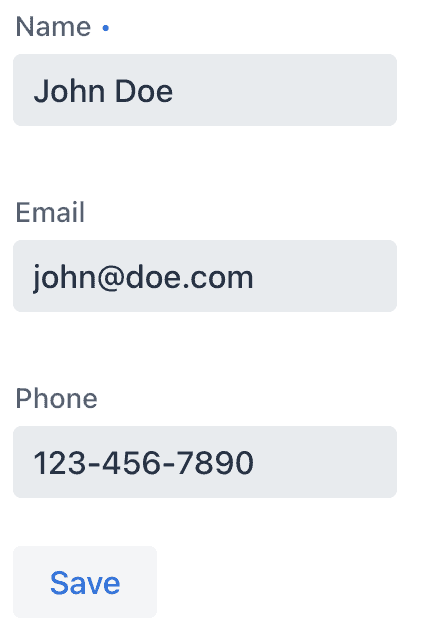
We connect the Binder to the model by calling setBean():
var contact = new Contact("John Doe", "[email protected]", "123-456-7890");
binder.setBean(contact);
When saving, we verify that the bound values are valid before using the saved object:
saveButton.addClickListener(e -> {
    if (binder.validate().isOk()) {
        Notification.show("Saved " + contact);
    }
});
9. 实时数据推送和更新
Vaadin Flow supports WebSockets for pushing UI updates to the browser. Enable WebSocket communication by adding a @Push annotation on a class extending AppShellConfigurator, typically the Spring Boot Application class:
@Push
@SpringBootApplication
public class Application implements AppShellConfigurator {
}
When updating the UI from a background thread, like from a Flux in the example below, we need to use ui.access() to ensure Flow is notified of the change and can push it to the browser:
var output = new Span();

// Publish server time once a second
var serverTime = Flux.interval(Duration.ofSeconds(1))
  .map(o -> "Server time: " + Instant.now());

serverTime.subscribe(time ->
  getUI().ifPresent(ui ->
    ui.access(() -> {
        output.setText(time);
    })
  )
);

add(output);
10. 生产环境构建
Building a Vaadin Flow application for production requires using the production Maven profile. The production build creates an optimized frontend JavaScript bundle and turns off development-time debugging. The profile is included automatically in projects created on Spring Initializr and Vaadin Start. We can also add it manually if we have a custom project:
<profile>
    <!-- Production mode is activated using -Pproduction -->
    <id>production</id>
    <dependencies>
        <!-- Exclude development dependencies from production -->
        <dependency>
            <groupId>com.vaadin</groupId>
            <artifactId>vaadin-core</artifactId>
            <exclusions>
                <exclusion>
                    <groupId>com.vaadin</groupId>
                    <artifactId>vaadin-dev</artifactId>
                </exclusion>
            </exclusions>
        </dependency>
    </dependencies>
    <build>
        <plugins>
            <plugin>
                <groupId>com.vaadin</groupId>
                <artifactId>vaadin-maven-plugin</artifactId>
                <version>${vaadin.version}</version>
                <executions>
                    <execution>
                        <goals>
                            <goal>build-frontend</goal>
                        </goals>
                        <phase>compile</phase>
                    </execution>
                </executions>
            </plugin>
        </plugins>
    </build>
</profile>
We build the project using the the production profile by running:
./mvnw package -Pproduction
11. 总结
In this tutorial, we learned the basics of Vaadin Flow, a framework for building full-stack web applications in Java. It includes an extensive set of UI components and powerful features for displaying and editing data. Because it runs on the JVM, we can directly access backend services without the need for separate REST endpoints.
And, as always, the code can be found over on GitHub.