1. 简介
本文介绍如何在聚类分析中使用 Silhouette Plot(轮廓图)。
聚类是无监督学习的一种常见方法。我们首先解释 Silhouette Value(轮廓值)的含义、计算方式与解读方法,然后展示如何通过平均 Silhouette Value 来确定最佳聚类数量。
2. Silhouette Plot 在聚类分析中的作用
Silhouette Plot 是一种图形工具,用于展示数据点在所分配聚类中的拟合程度。
它反映两个关键指标:
- Cohesion(内聚度):表示一个数据点与其所在聚类中其他点的相似程度
- Separation(分离度):表示该点与其他聚类之间的区分程度
通过 Silhouette Plot,我们可以同时评估这两个指标,从而判断聚类结构的质量。
3. Silhouette Value 的计算与解读
Silhouette Value 是由两个指标组合而成:Cohesion 和 Separation。
3.1. Cohesion(内聚度)
定义:衡量同一聚类中点之间的相似性,是 intra-cluster 指标
公式:对于聚类 $ C $ 中的点 $ x_i $,其 Cohesion 为:
$$ a_i = \mathrm{mean}_{x_j \in C}(distance(x_i, x_j)) $$
3.2. Separation(分离度)
定义:衡量当前点与其他聚类之间的区分程度,是 inter-cluster 指标
公式:对于点 $ x_i \in C_1 $,其 Separation 为:
$$ b_i = \min_{C_2 \neq C_1}(mean_{x_j \in C_2}(distance(x_i, x_j))) $$
3.3. Silhouette Value 的计算公式
将 Cohesion 和 Separation 合并为一个指标:
$$ s_i = \frac{b_i - a_i}{\max(a_i, b_i)} $$
- 取值范围:[-1, 1]
- 解读:
- 接近 1:说明该点非常合适当前聚类
- 接近 0:说明该点可能属于其他聚类
- 负数:说明该点可能被错误分类
3.4. Silhouette Value 的计算示例
考虑如下图中的三个聚类 A、B、C:
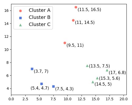
以点 (9.5, 11) ∈ A 为例:
- Cohesion:计算该点到 A 中其他点的距离均值,结果为 2
- Separation:
- 到 B 的平均距离 ≈ 11
- 到 C 的平均距离 ≈ 10.9
- 取最小值:10.9
最终 Silhouette Value 为:
$$ s_i = \frac{10.9 - 2}{\max(10.9, 2)} = \frac{8.9}{10.9} \approx 0.8 $$
✅ 结论:该点聚类合理,Silhouette 值接近最大值 1
3.5. Silhouette Value 的分析
| Silhouette 值 | 含义 |
|---|---|
| 接近 1 | 数据点高度适配当前聚类 |
| 接近 0 | 数据点可能属于多个聚类 |
| 负值 | 数据点可能被错误分类 |
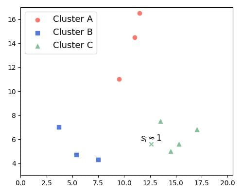
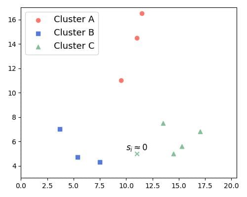
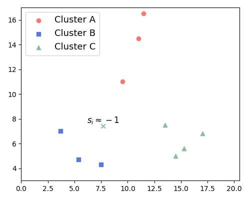
下面是一些示例图:
s(i) ≈ 1:点与本聚类紧密,与其他聚类明显分离
s(i) ≈ 0:点与本聚类和其他聚类的距离相近
s(i) ≈ -1:点更接近其他聚类,疑似误分类
4. Silhouette Plot 的可视化
Silhouette Plot 是将聚类中所有点的 Silhouette Value 按照降序排列绘制的图形,每个聚类用不同颜色标识,并留出空白间隔。
示例:K-Means 聚类(k=2)
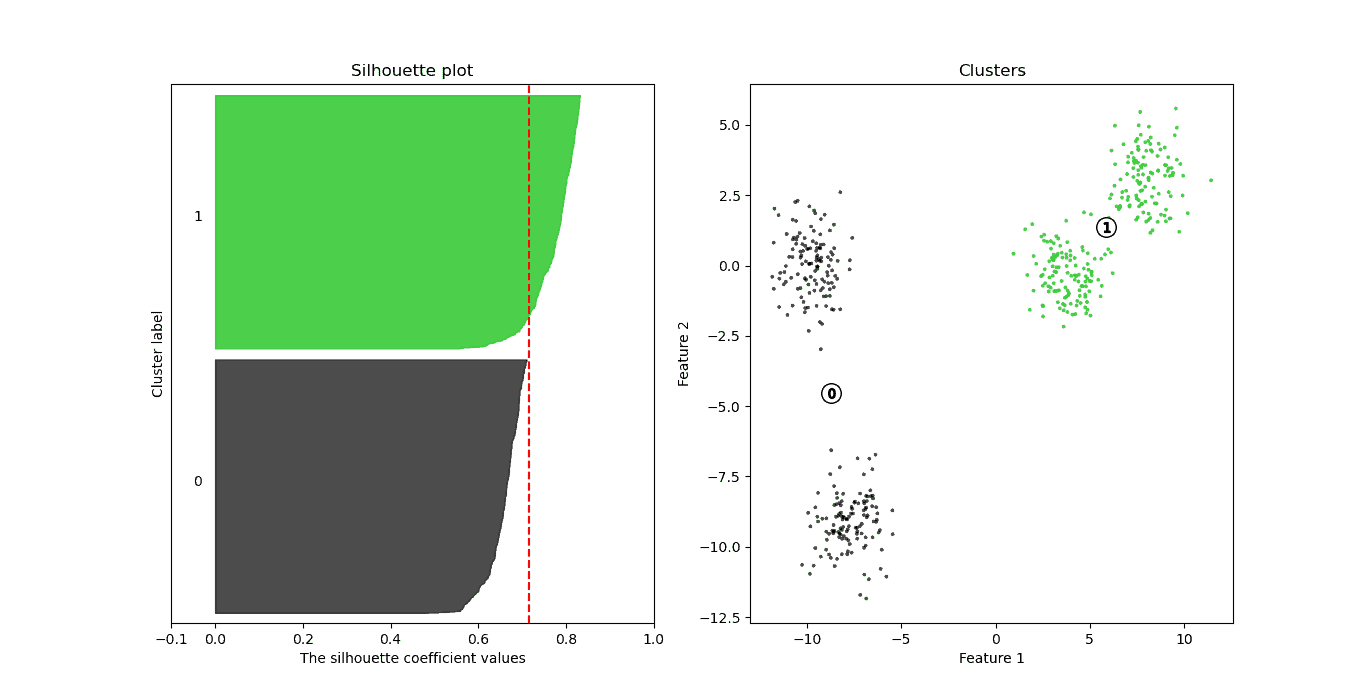
- 左侧为 Silhouette Plot,x 轴为 Silhouette 值,每个条形高度表示该聚类中点的数量
- 右侧为数据点的可视化,颜色与左侧一致
- 红色虚线表示平均 Silhouette 值(0.71)
📌 观察:绿色聚类的 Cohesion 更强,Silhouette 更好;黑色聚类略差,但整体仍良好。
5. 使用 Silhouette 值选择最佳聚类数 k
通过绘制不同 k 值下的 Silhouette Plot,可以判断哪个 k 值最符合数据结构。
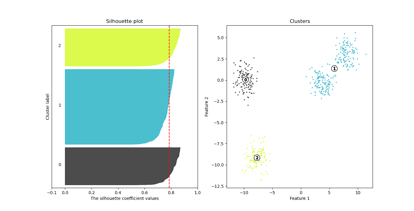
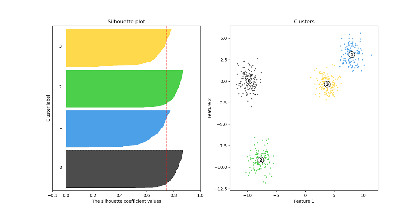
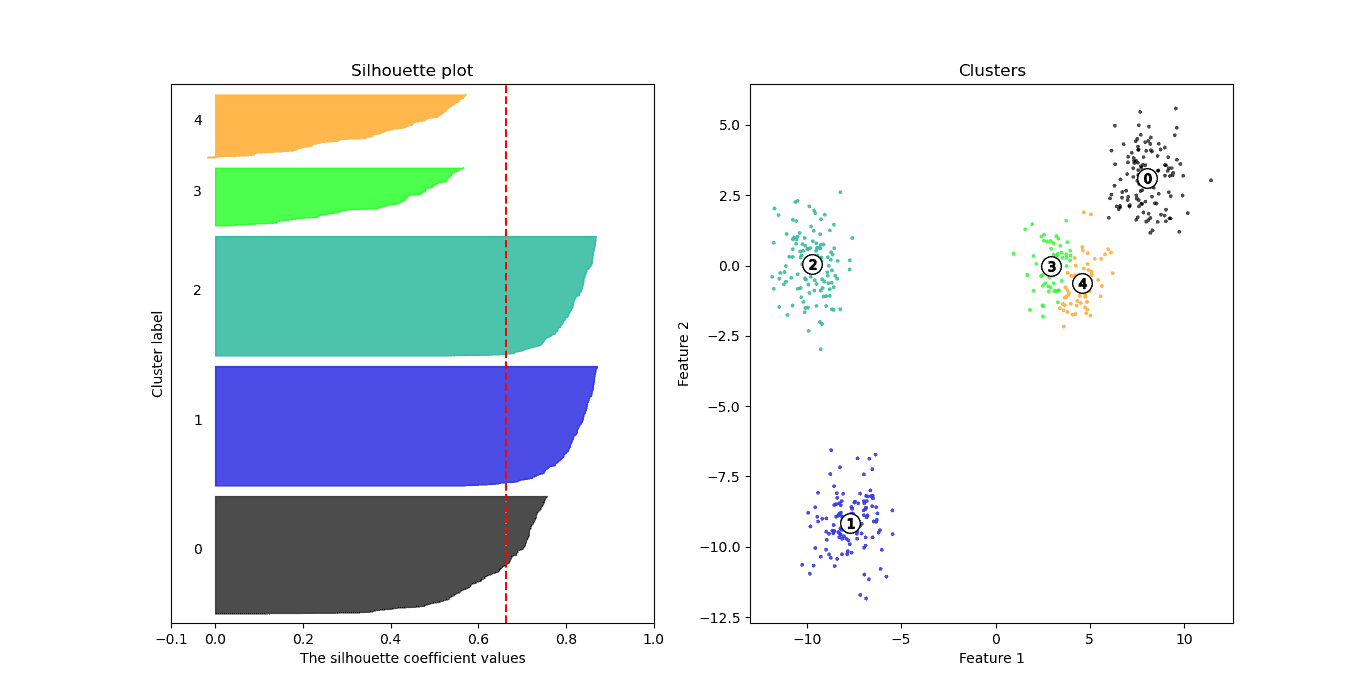
示例:不同 k 值的 Silhouette Score
| k 值 | Silhouette Score |
|---|---|
| 2 | 0.7143 |
| 3 | 0.7866 ✅ |
| 4 | 0.7456 |
| 5 | 0.6633 |
| 6 | 0.5392 |
图形对比:
k=3:平均 Silhouette 值最高(0.78)
k=4:略有下降(0.74)
k=5:下降明显(0.66)
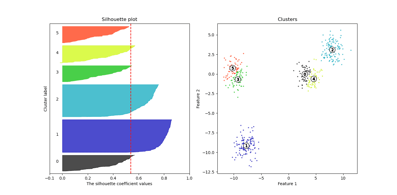
k=6:最低(0.53)
5.1. Silhouette Score 的解读标准(Kaufmann & Rousseeuw, 1990)
| Silhouette Coefficient (SC) | 聚类质量 |
|---|---|
| > 0.70 | 非常强 |
| 0.51 - 0.70 | 合理 |
| < 0.51 | 较差 |
根据此标准:
- ✅ k=2、3、4:结构合理
- ❌ k=5、6:结构较差
📌 踩坑提醒:虽然数据来自 4 个 blob,但 k=3 的 Silhouette Score 更高,说明聚类效果更优。这提示我们:不能仅凭数据来源判断最佳聚类数,需结合评估指标。
6. 总结
- Silhouette Plot 是一种用于评估聚类质量的图形化工具
- Silhouette Value 综合了 Cohesion 和 Separation,取值范围 [-1, 1]
- 平均 Silhouette 值越高,说明聚类结构越清晰
- 通过比较不同 k 值下的 Silhouette Score,可以辅助选择最佳聚类数
- 结合图形与数值分析,能更准确地判断聚类结果的质量
✅ 建议:在使用 K-Means 或其他聚类算法时,推荐将 Silhouette 分析作为评估聚类效果的重要手段之一。